
It’s really hard to top a classic. By the very definition of it, a “classic” is something that sets a standard, defines an era, and endures time. While there have been occasions where a “refresh” equalled or exceeded the original, it’s a rare circumstance.
I recall growing up in the early 70s, I’d see the older kids getting their first cars. A few were lucky enough to hit the jackpot, and would drive around the neighborhood in a Ford Mustang. You simply couldn’t get any cooler than that, especially if it was a convertible. The car was only about a decade old, but had firmly entrenched itself in the minds of people everywhere.
Until 1974.
The gas crisis hit the US hard, and overnight cars needed to be smaller and more fuel efficient. Ford tried to respond with the 1974 Mustang.
Suddenly… none of the kids getting new cars wanted a Mustang. The ’74 edition was… ugly. It looked more like a sedan trying to be sporty.The first generation pony car had set a standard that could not be messed with.
You Changed What?
Of course, the greatest blunder in this arena I can think of is Coke. The Coca Cola company had a proven formula that people loved. Their chief competitor, Pepsi, was gaining through marketing. Their cola had a sweeter taste. However, instead of countering with marketing of their own, Coke chose to change the formula, opting for a sweeter taste that was a bit too much like Pepsi.
New Coke was the result. They didn’t call it “New Coke”, of course. Just Coke. But everyone new the difference – and it was awful. Consumers hated it. I recall working at a McDonalds at the time, and people would ask “do you still have Old Coke?”
Eventually, Coca Cola Company had to admit that you can’t improve on a classic, and they brought back “Classic Coke”. After a few years. “New Coke” went away. Rightly so, if you ask me.
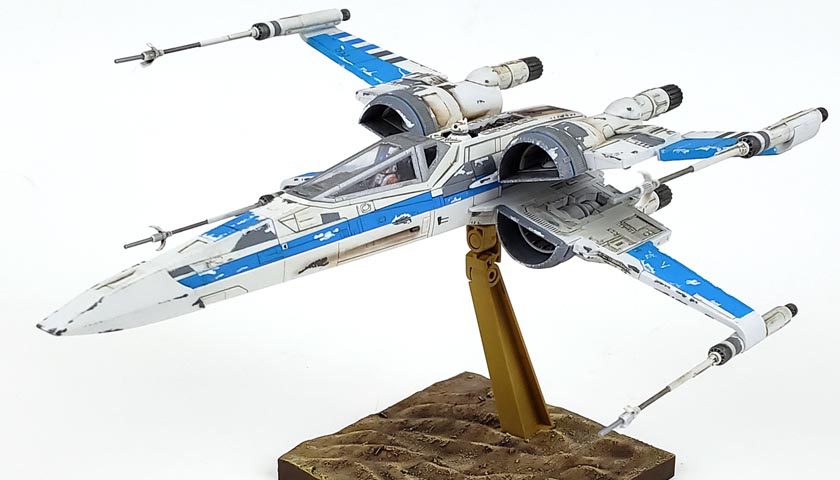
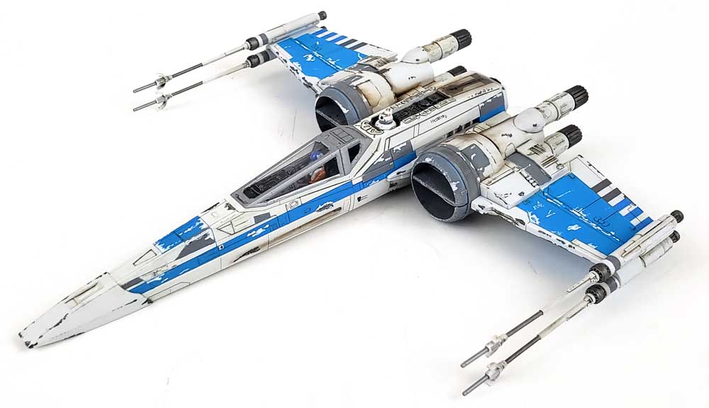
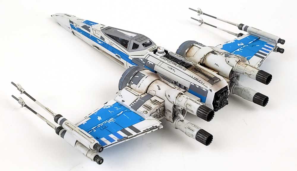
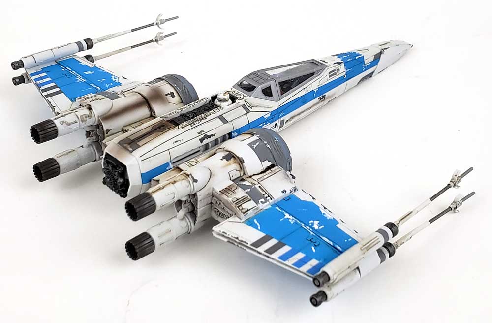
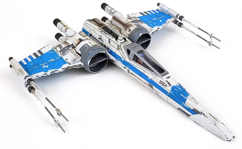
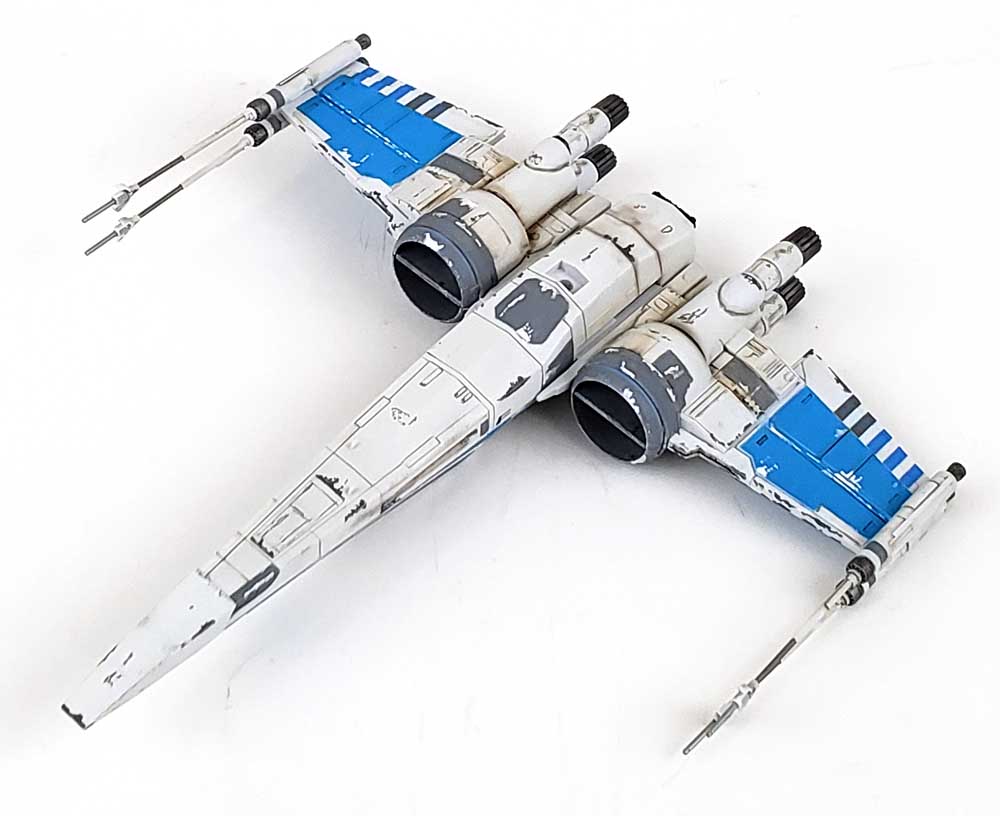
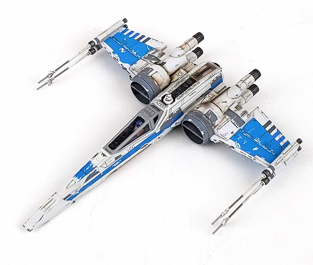
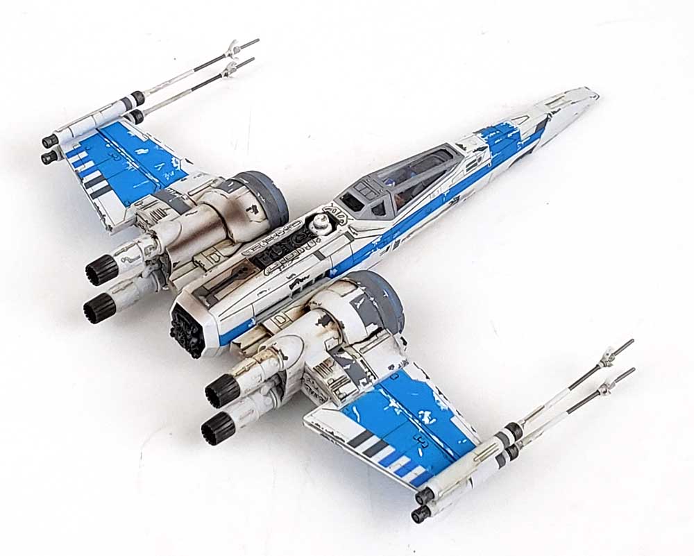
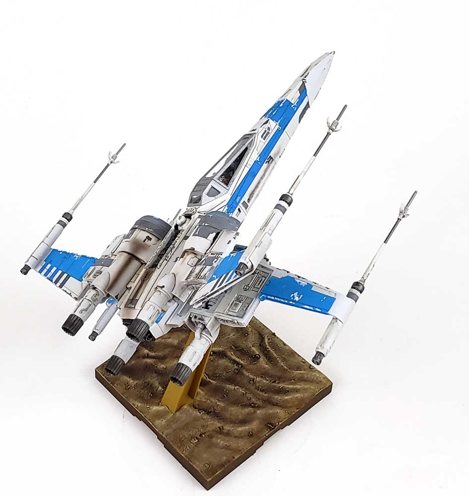
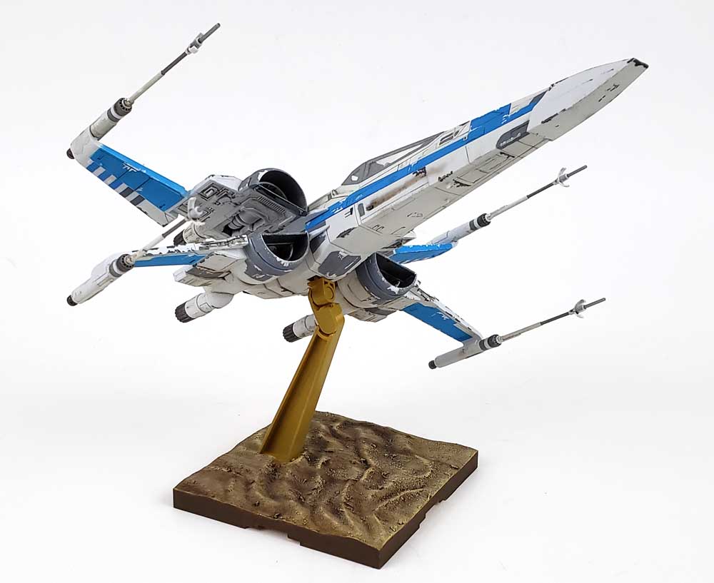
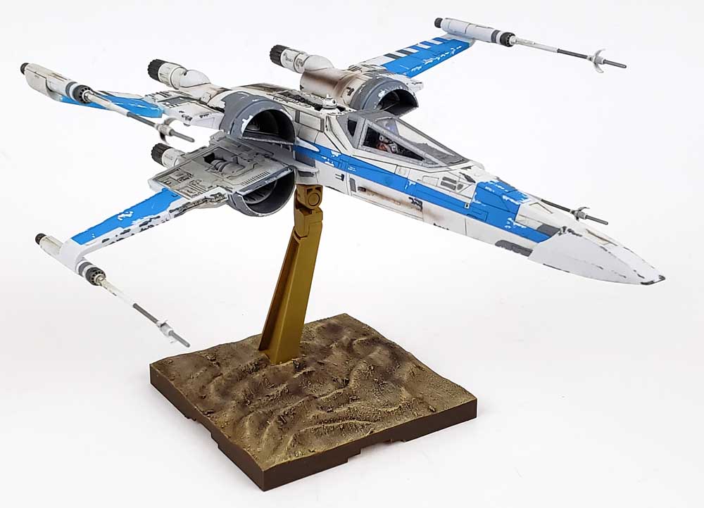
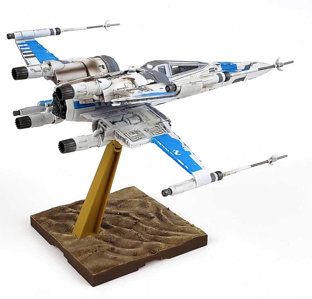
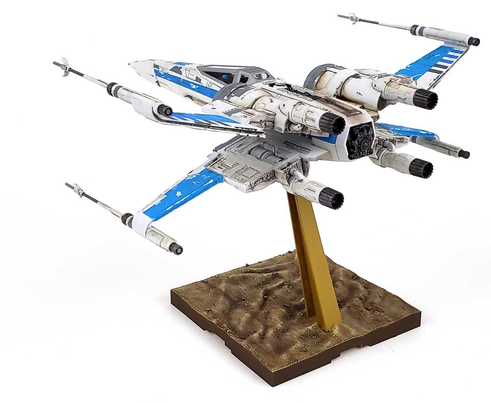
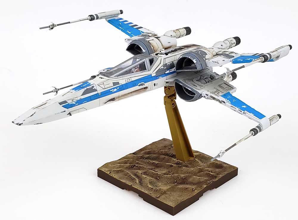
No Resistance To This X-Wing
I’d learned from building the original X-Wing Fighter featured in Star Wars that it needed a slightly different approach than most of the Bandai kits from that series. Because of the color separation, the fuselage was built from quite a few parts of different color, all of which came together to form a single unit. In that build, I’d mostly painted all of the various colors after assembly. It worked out fine, but quite a bit of masking and hand painting was required.
For the Resistance version of the iconic ship, I decided to trust Bandai fit, and paint all of the parts ahead of time, then assembling them into various sub-components. Lacquer based paints were used for this, with AK Interactive Real Color White Gray and Mr. Color Gundam Color RX-78 Blue Ver. Anime Color being the colors of choice. Because lacquers adhere so well (better than Badger’s Stynylrez even!), I did not start with a primer coat. The lacquers acted as both paint and primer.
With those main colors applied, I was left with the next major color – gray.
Those Decals
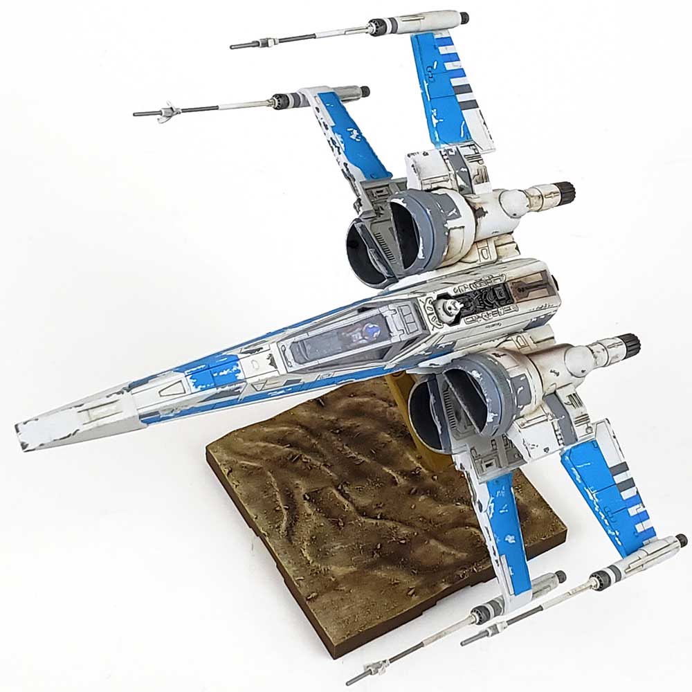
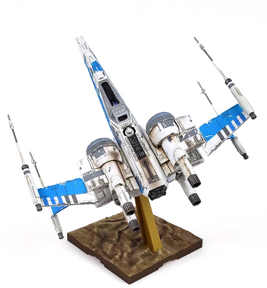
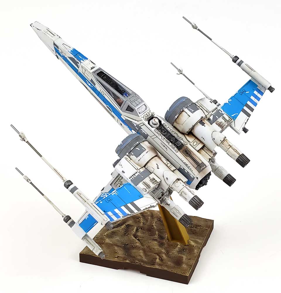
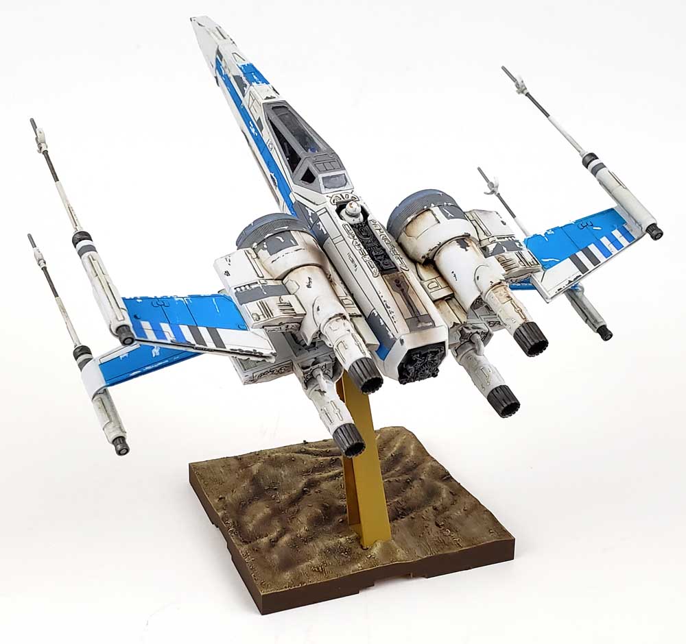
While Bandai does a great job of color separation with the plastic parts, some of the craft from the Star Wars universe have so many blocks of varying color that it would be just about impossible to cast them all in plastic. And while the Resistance X-Wing has a much simpler color palette – basically white, blue, and gray – there are lots of little color spots, the gray having some especially small areas.
For areas like that, Bandai most often resorts to waterslide decals in their Star Wars kits. (They provide stickers, too…) And while their decals are of very high quality, trying to fit any two dimensional form over a complex three dimensional shape rarely works out.
My initial plan had been to mask off the various gray parts, and airbrush them. However… a few minutes into that process, I realized that the old “mask for 2 hours, paint for 2 minutes” adage was more likely to be “mask for 2 days”. The decision was quickly made to fall back to what I’d done on the Original X-Wing: brush paint.
Hitting The Details
The decal was almost neutral gray, so a mix of two parts Neutral Gray and one part Sky Gray – both Vallejo Model Color, was declared close enough. As most of the parts were separated by panel lines, painting was easily done, using a brush with a sharp tip.
The trick in doing this was to get the paint thinned to a point that it flowed nicely from the brush, but not so thin that it flowed like a wash. While I’m a firm believer in “multiple thin coats”, sometimes when painting tight detail I like to use an approach that is more “wet”. Painting a small panel in a thicker coat that is wet allows the paint to “merge”, and when it dries, a smooth finish is usually achieved. With practice it becomes a handy tool.
A few more areas were touched up with the lacquer paints, using a brush. The nifty thing about lacquer paints is the fact that they never cure. They dry rock solid… but touch a bit of thinner to them, and they’re activated. When touching up spots by brush, I’ve learned to allow for a bit more paint to be applied, with a little more thinner. This activates the paint around it, so when it dries, it all just sort of mixes together. (A handy tip I learned from Lincoln Wright!)
Weathering Choices
There are many options available when it comes to scifi space fighters. In the Star Wars universe, the onscreen look tends to be the main colors are chipped back to the white, and the rest is mostly grimy, oily, smoky stains. A more “realistic” approach can be taken, opting for far fewer chips, but more leaks and stains. Still again, sometimes a heavily chipped look – even on the white – can yield nice results.
I opted to do a blending of the three, for no other reason than I thought it might look cool. Eschewing the typical sponge application I normally use, initial chips were applied to the blue and gray areas. These were added with a #0 liner brush, the paint being Vallejo Model Color White Gray 70.993. While this was a little brighter than the AK lacquer paint, it was close enough to work.
Larger chips were applied, rather than loads of tiny ones. My thinking was that fewer but larger chips would produce a more dramatic look, conveying “worn”, without covering every single edge with tiny chips. A few applications on the underside to test the theory yielded pleasing results, so I moved forward. Once I had the blue and white areas chipped, I switched over to VMC Neutral Gray for chipping the white. I tested chipping some of the white chips with additional gray, but I didn’t like the look, so that was not further pursued.
The Stain On The Plane Falls Mainly In The Rain
I’ve had quite a few discussions with other modelers regarding stains on spacecraft. Many would argue that – in theory – any stain is a bad thing. When you’re flying in space, pretty much every fluid you have is in a limited supply. So any leaks from a system are bad, even potentially catastrophic. It’s not like you can zip into the local Space Wal-mart and pick up some Space Fluid, a few Slim Jims, an air filter, and a case of Sam’s Cola. (All the while standing behind the alien lady in the lime green spandex that is waaaaay to tight. 🙂 )
Others argue that because it’s science fiction, some or all of the rules can be thrown out. Essentially, you can pop into the Space Wal-mart, or even that diner where the Alien crew is hanging out. (Just don’t order The Special…)
Both arguments try to factor in some form of realism, real or imagined.
I prefer a simpler approach – the rule of cool. Do what you think looks cool. Period. It’s all made up stuff anyway. 🙂
Practical Application Of Grime
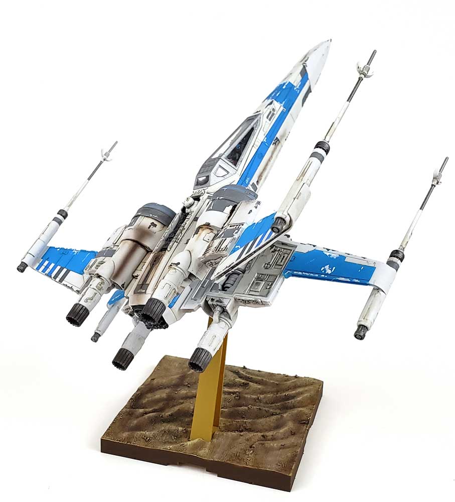
I starting by applying Vallejo Weathering Petrol Stains, focusing mainly around the engines. This has become a favorite method for me. It allows most stains to be applied with quick drying acrylics, and then oils or enamels can be added in smaller amounts to refine the overall look.
The effect I went for was “nondescript grimy”. The stains are there, and there may be some logic to them, but the idea is not to satisfy the close-up examination, but rather to present a pleasing look in an overall assessment. In my mind, that’s more “movie like”, as we only get fleeting glimpses of these craft for the most part, and thus only a chance to quickly assess them. There’ no notice of “that element has a large, three color stain”, but rather “that fighter was kinda grimy”.
If nothing else, it makes for good blogging. 😉
After the acrylics were added, I used Ammo of Mig Starship Filth Oilbrusher to blend and streak oils. Acrylics make a great base, but nothing streaks like oils. The longer working time gives them unmatched flexibility. After allowing those to dry overnight, additional smoke effects were applied with the airbrush, using a 2-1 mix of Tamiya Nato Black and Hull Red. A few panel lines and chips were enhanced with a mechanical pencil, a matte coat was applied, and the model itself was finished.
Dressing Up The Base
Whenever I build a Bandai Star Wars kit, I generally get near the end, and suddenly notice the bare plastic base still sitting in the box. This time was no different.
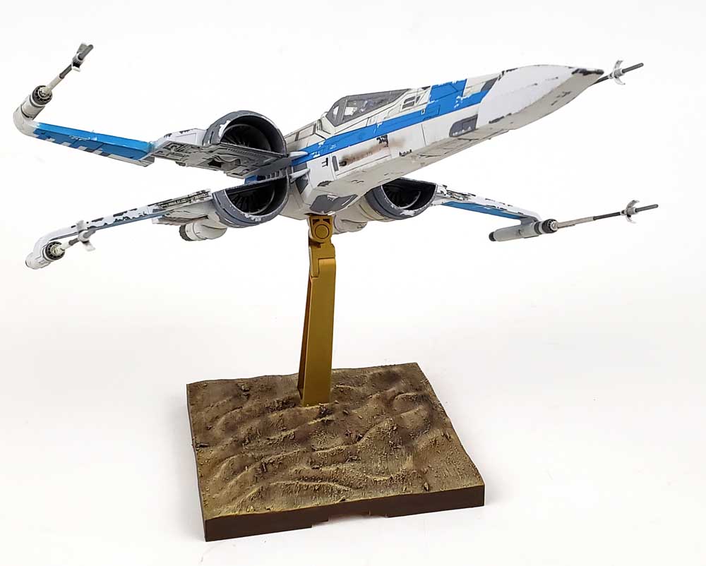
It’s an odd looking base, really. Cast in a dark tan color, the surface features a “rolling wave” appearance. I don’t know if it’s supposed to be dunes as viewed from altitude, or rolling sand at low level. In contemplating “what can I do in two hours”, I opted for the notion that dunes from a reasonable altitude was the intent.
I added some Vallejo European Mud, a thick acrylic product that has small bits of texture in it. It was applied in a sort of drybrush motion, from front to back. I didn’t want total coverage, but a look that would (hopefully) invite the viewer to believe those were rocks far below the model.
AK Interactive Real Color Middlestone was airbrushed on, and then a heavy coat of Citadel Agrax Earthshade was applied as a wash. Vallejo Model Color Iraqi Desert was then heavily drybrushed on, again going from front to back. A few streaks were added with VMC Chocolate Brown. The theory was to make it look as if the scenery beneath was passing by at speed, though I fear it basically looks like some stuff was hurriedly brushed on at the last minute.
For the sake of saving face, I’ll just say I did not want the base to overshadow the model. That sounds, good, right? 😉
Hard To Beat The Original
I’d have never thought that you could alter the design of the iconic X-Wing and still retain the essence of what made it the classic it is. Somehow though, the designers of the Star Wars universe did. They made it sleeker, more streamlined, and yet retained the tough profile of the original. The closed wings were cleverly merged into front and aft halves, only apparent when deployed. The four engine intakes were merged into two, yet when opened up, remained distinct. The profile of the canopy was lengthened, giving it a look of speed even when sitting still.
In short, they improved on a few elements, but left the essence of what made the X-Wing Fighter the star of the show without alteration.
Bandai, in turn, took the design and actually made what I think is a better kit. While I loved building the Original X-Wing, this Resistance version made for an even more satisfying experience – something that surprised me. (I was actually expecting the opposite.)
This is a really good kit. Even if you’re not a fan of the new movie series, this model retains the classic lines, yet brings in its own look that is very pleasing. Any modeler – from a brand new beginner in elementary school to a seasoned plastic vet, can enjoy this.
And the best part is it’s just plain fun.
Leave a Reply