I don’t think I’ll ever forget the first appearance of the TIE Fighter in Star Wars. I was 10 years old when it came out, and the movie had me in its grips from the first blast of music through the speakers right up to the end.
Throughout the movie, I was completely caught up in the story. Even though I hoped it would all end up good, I sweated every new development, worried that it might not.
When the TIE Fighter first appeared, it was that sound which really got to me. It had a sinister, haunting, villainous sound. No one had to tell you the bad guys were on the screen. The very audio track indicated evil intent.
As the movie progressed, and more TIE fighters were on screen, I grew to dislike them intently. Visually there was nothing pleasing to the eye about them. They weren’t colorful, or sleek. A ping-pong ball with waffle iron plates stuck on either side.
Plus, the bad guys used them. What’s not to dislike? 😉
Just Go Away!
By the end, I was in fits… would someone please clear these little tyrannical flies from around the Death Star? They are seriously interfering with the hero getting on with his business.
Popcorn long gone, I sat wide eyed as the trench scene unfolded. More TIE Fighters rolled in, shooting down the Alliance fighters intent on the Death Star’s destruction. Even Darth Vader joined the fray in his TIE Fighter. Though in an admittedly cooler design than the stock model, he was evil personified. He needed to go away.
I recall being almost in tears… it was just Luke, roaring down the trench. Hot in pursuit were Darth Vader and two other of his henchman, their oddly shaped fighters screeching as they followed. It could not end this way. The X-Wing was way cooler than the stupid TIE Fighter.
Yet Vader’s crosshairs finally aligned.
Bandai Star Wars Kits
It gets to the point that finding superlatives for a Bandai Star Wars model is almost ridiculous. This is my seventh kit from the line, and every one has been amazing. Wonderful detail, sharp moldings, amazing fit – and they are all snap tight. They are simply the best models I have ever worked with. Full stop. I can’t add any qualifications.
Yes, there are other models and other brands that are good, some very good. Tamiya and Eduard always come to mind, of course. I’m sure there are others people would argue for. Even kits that aren’t of this quality can be fun to build.
Yet I simply cannot think of another line of kits that is superior to these. I suppose the only criticism I can level is there aren’t MORE. (How about one of those Bespin Cloud Cars? That would be cool!)
And before you level the “fanboy” charge, stop and think about it… why wouldn’t I be a fan of kits this good? If you build models primarily for the enjoyment of the experience, building the best available yields the most fun. Yes, fanboy I am. Argue I will not. 😉 Even if the genre or universe is not necessarily your thing – not building at least a few of Bandai’s models from a galaxy far, far away is a loss for you.
Ugly And Dressed Funny
I’ll admit freely that I picked up this Bandai TIE Fighter not because I like the look of the design, but simply because I wanted to build another Star Wars model from that manufacturer. It’s shape is not pleasing to my eye, and if taken as “real world” it’s ridiculously odd.
The physical layout of the design leaves little room for engines. The armament seems to be short and stubby… very unimpressive. The giant “solar panels” slung off on each side make any hope of a short range visual engagement virtually impossible. From a color standpoint, it’s as bland as everything else in the Empire… as gray and black as the emperor’s heart.
It’s not even that successful a design in the movies. Kids right off of a moisture farm can blow them out of the sky. Swarms of them can’t shoot down a freighter ship. (Though she is the fastest hunk of junk in the galaxy… 😉 ) The only reason they can seem to shoot down Alliance fighters is if those fellows are focused a specific target.
Plus, let’s face it. The TIE Fighter is the bad guy.
Yet…
Still, I knew because it was Bandai the build would be fun. And when I opened the kit, I was not let down. Gorgeously detailed parts, capturing every line and greebly of the original. As with other kits in the line, many of the surface parts, on close examination, are recognizable from the donor model.
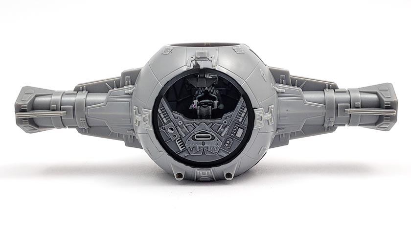
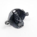
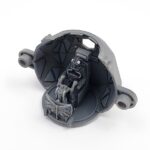
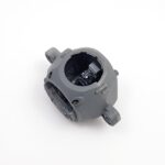
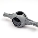
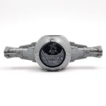
Because this is a simple design, the parts count is not high. The engineering is great – a simple internal “pod” makes up the cockpit, and it fits neatly into the external hull.
The interior is elegantly minimal – a front and rear portion, floor with seat, a control column, and a pilot. It’s very utilitarian. While the Alliance cockpits look like a modern jet fighter, with dials and gauges and wires and tubes, the TIE Fighter interior reflects the very Empire it represents. Cold, impersonal, void of anything other than what is needed to get the job done.
Which of course makes for a fun challenge to model.
Minimalist Painting For A Minimalist Design
I knew going in that the paint work would essentially be shades of gray. And while on the surface that may seem a bit boring, in a weird way I think it actually gives some freedom.
When working with colors, there’s always the need to think in terms of balance. Does this color work with that color? Quite often we can end up with a palette that is quite jarring. It’s as if someone took the color wheel and made it a color blob… all mixed up and out of balance.
An all gray subject, however, simplifies things. Everything comes down to light and contrast. Even the most subtle of change can register with the eye, which allows shadow and highlight to be maximized.
Actually Getting To The Modeling Part Now
I started by priming all of the interior parts in Badger’s Stynylrez Gray primer. Bandai’s method of casting is great for precise fit, but not so much when it comes to paint adherence. A good primer coat remedies that situation.
As I looked for a nice, neutral gray to follow up with, a tiny light bulb went off in my noggin, a neuron fired, and I realized it was already neutral gray. Sometimes I tend to overcomplicate things…
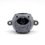
As I examined the cockpit interior, I decided that the various geometric shapes that lined the walls should be slightly lighter. This would help them stand out a bit once later examined, and would also provide additional contrast for the shadows that would be eventually added.
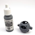
I mixed equal parts of Vallejo Model Color (VMC) Sky Gray with VMC Neutral Gray. I thinned it down with an equal amount of water, giving it a nice consistency that flowed from the brush well, yet was “solid” enough to not rummage around in places I did not intend. Using a #0 round brush, I carefully painted all of the raised triangles and squares and other shapes the names of which elude me. 🙂
More Highlights…
The result of that initial paint layer was exactly what I’d hoped for – there was enough contrast to “raise” those panels from the background, yet not so much to bring it into a lighter gray. (Which might be seen as too happy in the Imperial paint store.)
Another drop of VMC Sky Gray was added to the mix, and this was used to paint additional details inside the cockpit. While it doesn’t take a lot of color contrast for larger areas to be highlighted, smaller parts often benefit from a bit more contrast, which helps them stand out.
A very light drybrush of straight VMC Sky Gray was then applied using a very soft makeup brush. I’ve just started using these for the method, and I love how well they work. Unlike most of the brushes I’ve used in the past – proper paint brushes – these makeup brushes are so very soft that they allow just the barest hint of color to be deposited on raised edges, yet have little tendency to leave the “dusty” effect other harsher brushes may impart.
A few raised edges were given a harder edge highlight, again using Sky Gray. These were applied with the #0 round, using just the edge near the tip to trace along some of the upturned edges. This gave a bit more depth to the sections chosen.
…And Shadows
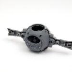
The shadows were added in initially by lining the major detail with a sharp .5 mm mechanical pencil. I’ve found this can be incredibly helpful to make sure that later applications of darker wash really stand out, even if an area here or there is a bit spotty. While the graphite will impart a metallic sheen that may not be wanted, later matte coats will essentially cover that up, leaving a very dark gray.
Over the top of that, I added Citadel Nuln Oil Gloss. As I’d not already gloss coated the interior, I chose that shade (wash) because it does not have a tendency to “bleed” as its flat alternative can when applied over a unglossed surface. I also was counting on the satin finish of the gray primer to help out in that regard.
Again turning to my #0 liner, I carefully outlined all raised detail, and touched the recessed detail to add shadow there also. In most cases, if I had a mess-up here or there, I’d have either retouched it with neutral gray, or cleaned it up with a bit of thinner. However, because the interior is so small, and will be mostly hidden, I left it be.
The Barest Touch Of Color
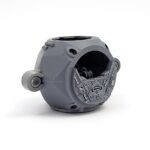
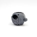
The only real color in the interior are the bits of red on the decals. The TIE Fighter has an odd assortment of readout panels behind the pilot… not really helpful if you’ve slept a bit wrong and can’t turn your head around very much. However, I do see the logic of their placement from a filming standpoint.
Bandai provides decals for each of these little monitors, which were set in place and touched with a bit of Solvaset to make sure they held fast.
A few details that adorned the “rear window” were touched up with a Prismacolor Silver pencil. I saved this for last, as Prismacolor can be washed off with some paint and wash application. My goal here was not to make it silver, but rather to add a good deal of contrast.
A final matte coat finished it off.
You Know What’s Next
When Han rocketed in from above, removing the nefarious threat to Luke’s heroics, I jumped up and shouted. I recall many others had the same reaction. A few people clapped and whooped. I wasn’t the only one who was caught up in the wonderful world of Lucas’ make believe.
You know what happened…. the one-in-a-million shot, the satisfying explosion, and the big celebration at the end. Yet it wasn’t lost on me that Vader was still alive….
While 10-year-old Jon is not really jazzed up about allowing a TIE Fighter into the model workspace, he does agree that the kit is pretty darn cool, and a lot of fun to build.
And it truly is. Though this cockpit section was quite sparse on parts, and with minimal detail, I had a blast painting it. It’s one of the phases of a model build that I do not because it will be seen, but rather to enjoy the journey.
I think that goes to show just how good these kits really are. Even a design that I don’t really like, portraying a faction I’m not a fan of, makes for a fun kit. That’s what it’s really about in the end.
Having fun.

Leave a Reply