
Drawing was something I always did as a kid. At a very early age, anything that could accept crayon or pen or pencil – regardless if it was intended to – was the target of my “artistry”. Eventually, my mom brought home a giant roll of butcher paper for me, and I could tear off a sheet several feet long and draw all day.
I suppose as kids go, my work was not outstanding. I could draw better than some, yet not others. However, what folks did note was that I liked to out in little details with every drawing. They also complimented me that everything I drew – and I mean everything – had a story behind it.
My early drawings were happy, child-like subjects. Flowers, sky, houses, dogs, and occasionally a friendly little alien character that seemed to show up in a lot of my work. As I got older, and began reading more history… especially WWII aviation subjects, my work began to change. The simple squared off airplane shapes began to take on new appearances. The curves of a Spitfire, the angles of a Mustang, and the bulk of a P-47 all began to emerge.
And though I can’t say I was an angry or violent kid – far from it really – the butcher paper canvas became far more chaotic. Airplanes twisted and turned in the sky, tracer rounds arced their way across the paper, explosions filled the air, and the good guys always parachuted to safety.
Facing Obstacles
As I learned shapes and shadow, my work improved. I could do a fairly good version of a fighter plane in a turning climb, even making sure to deflect all the control surfaces a bit to go with the movement. More detail was added in, such as ammo bay covers, gear door outlines, and various exhaust and cordite stains.
However, as much as my work was improving (though still very childlike), I never did get a handle on drawing faces. I could get the general shape down, but no matter how many books I checked out from the library, the concept never clicked. The poor pilot always ended up looking like an oval with a carrot stuck out the middle of his face.
Eventually, a friend showed me the trick. Using the edge of his pencil to create a gradient, he shaded his canopies to suggest glare. No more need for pilots. I was happy with the solution, because it just looked plain silly to have a decent looking Spitfire, piloted by Mr. Smiley Faced Carrot Nose man.
Painting Those Faces
Because my aircraft builds were always gear down, canopy open, everything I built for more than a decade was without a pilot. The techniques for finishing an aircraft in fairly decent form were continually polished and expanded. I could go into any project confident that I could tackle the finish.
Yet as I expanded into additional genres a few years ago, I realized that figure painting would have to be dealt with. And while many figures have helmets, quite a few don’t. And pie-faced carrot-nosed people aren’t really appealing in the scale model world. (My apologies to any pie-faced carrot-nosed people reading this… 🙂 )
Still, I started taking on subjects that helped stretch me. A Warhammer 40K Landspeeder Storm had six figures on it, and though I did my best at the time, I look back and am a bit horrified at my result. Another Warhammer project, a Chimera, turned out a bit better.
Enter Ma. K
Yet it was starting to build Maschinen Krieger that I fully realized I had a problem. My figure – and specifically face painting – skills were very much lacking. And while that may not seem like a big deal, but it bugged me. Nagged me.
My first Ma. K build, a New Rally Pawn, had a clear visor, and thus a pilot. I painted him, and he turned out OK, but not really… adequate for the task might be a better description.
The next few I built skirted the problem, much like the canopy shading of my youth. I simply built the fighting suit buttoned up. There is a pilot in there, and you can imagine he’s high;y realistic. You just can’t see him. 🙂
But when I started building the Ammoknight, I had to… face the facts. It was time to really tackle figure, and specifically, face painting.
Painting The Pilot
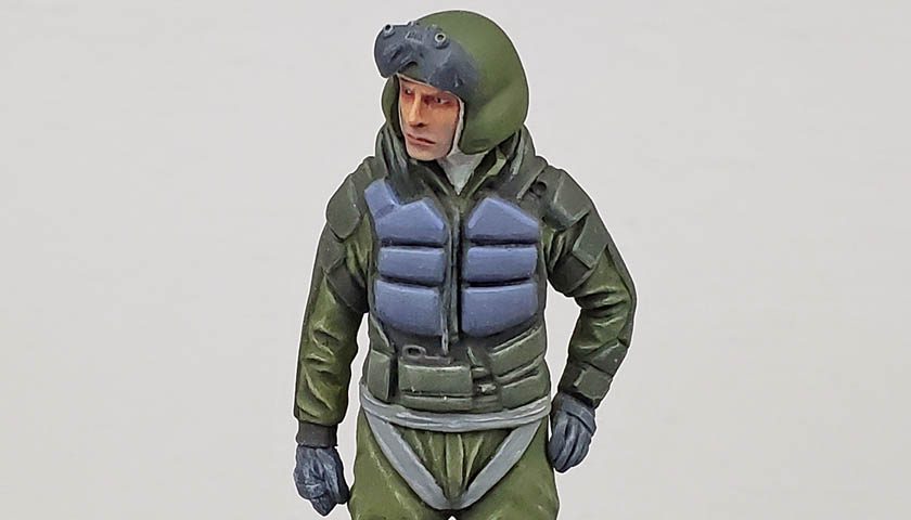
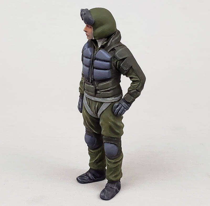
The Ammoknight kit is a bit different from the other Ma. K suits I’ve tackled. While those all had “flip top” lids, allowing only the pilot’s head to be seen, the Ammoknight opens up like a clamshell. And this particular kit featured a full standing figure. (Wonderfully posed in a “I’m a little teapot” stance, to quote Lincoln Wright. 😉 )
So the gauntlet was thrown down, so to speak.
I started by priming the figure with Vallejo primer, and then I gave the whole thing a coat of Tamiya XF-58 Olive Green. Because the majority of the pilot’s suit would be green, I decided to use this as the base.
From there, I used a lightened version of the olive green color, mixed from Vallejo paints, to drybrush the entire figure. While I know that many often poo-poo drybrushing, I’ve always felt that it was a good, solid technique that works well to establish a basis for other elements. In the context of this suit, it not only brought out the highlights, it also mapped out areas of contrast. Later coats of thinned, darker paint deepend the shadows.
Other elements of the pilot figure were picked out. The vest like contraption on the upper torso was a bit hard to figure out, so I decided that anything remotely associated with it would simply be dark green. That was painted with a darker version of the olive green color, and similarly highlighted.
The “lumps” on the chest were a mystery to me. I didn’t know if they were flotation devices, padding, or what. Drawing on my own military experience, I decided to declare them additional armor plating, and that for reasons that work mostly in my own head, they would be a blue gray. these were also painted and highlighted, using the layering method.
Other bits and bobs received paint too, and similar highlighting and shadowing. Of course, the focal point of any figure is the face.
Time to grow a bit, I suppose…
Facing The Facts
I’ve watched quite a few face painting videos. And my quest to improve is sincere… I’ve painted quite a few figures just to try the various methods. Yet each time, it’s been less than impressive to my eye. Still, I’ve seen improvement.
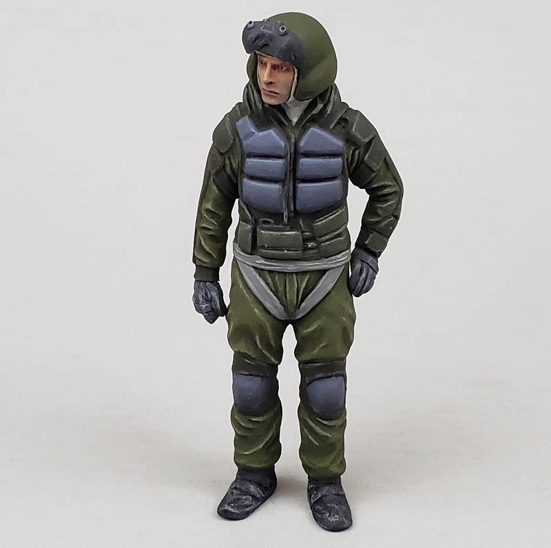
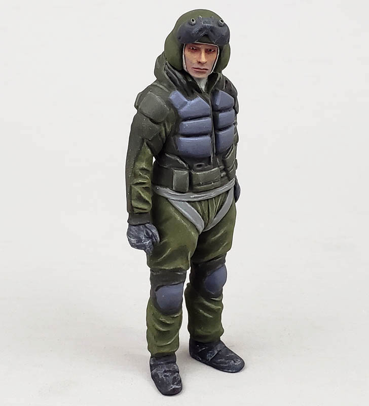
I started with a layer of Citadel’s Bugman’s glow. I like the “trilogy” of Citadel flash paints – Bugman’s Glow, Cadian Fleshtone, and Kislev flesh. I’m not enamored with them, but as they are what I have, they are what I used.
The Bugman’s Glow is a base paint, meaning it is designed to cover previous colors in a few thin coats. (And don’t ask me about the name.. I have no idea…) I applied this with an Army Painter Regiment Brush, which is about the size of a #1 round brush. It has a nice point, and holds paint well.
After the base was on, I started in with the Cadian Flesh tone. For this stage, I thinned the paint quite a bit. It wasn’t a glaze, or even a wash, but it was definitely a bit runny. Using the tiniest amount on the brush, I started giving some color to the highest features of the face, slowing expanding from there to blend it in to the Bugman’s glow.
Designate The Target
I wanted the pilot to look tired, drained, and angry. I left the area around and under the eyes as Bugman’s Glow, to hopefully impart a worn out look. The Cadian Fleshtone was slowly built up, the thin paint allowing a subtle (sort of) gradient to be applied.
The next color was the Kislev Flesh, which represented the brightest highlight. It’s usually at this stage I blow it… the figures goes from looking sorta kinda maybe human to “look – it’s Mimi from Drew Carey!” This was thinned even more, and carefully added on the very highest points of the figures face… the nose, checks, brow, and chin. Again, I attempted to blend it in with previous colors, though I feel I only partially succeeded.
To round out the suggestion of tired and worn out, I mixed a bit of the blue gray color I’d used on the suit with some Cadian Fleshtone. Thinning this down to a glaze consistency, I added it on very carefully to suggest some beard stubble. I didn’t want a full beard, obviously, but just that look of a face darkened by going a bit long without a shave.
So far, so good. (Kinda.)
A Piercing Gaze
As I mentioned, I wanted the pilot to look tired, drained, and angry. Tired and drained were easy, but anger can be hard to convey. If the figure had been sculpted yelling, that’s easy. But he was just looking. Staring.
The best way I could think of to convey anger was to give him very stark, high contrast, piercing eye pupils. The trouble is, I’ve always been awful at eyes.
To avoid the whites of the eyes being too bright, I used Vallejo’s Sky gray. This was carefully painted in, and a few touch-ups made with Bugmans Glow. At this point, he took on an eerie, demonic look. Better get those pupils in fast!
For those, I used another Army Painter brand brush, the Insane Detail brush. It’s very tiny, and very pointed. I actually have only used it a few times. It’s so small, and holds so little paint, that for many things it’s simply not practical. But for this, perfect.
I got just the barest dot of Vallejo’s Black Gray on it, and then carefully touched it to one eye, and then the other. (With a few adjustments that made me quite nervous!)
Looking at it from a foot or so away, it was… OK. the pupils were roughly the same size, and generally focused ont he same point. Not perfect, but adequate.
Yet… they somehow looked very piercing, and very angry. Then it hit me.
Lightning In A Bottle… Twice?
When I’d painted the New Rally Pawn’s figure, I had no real goal in mind, other than “don’t make it look awful.” Yet when I finished, I was quite astonished that I’d ended up with a passable Mr. Spock. I didn’t start out to arrive there, yet I did. Weird, right?
So as I looked at this Ammoknight figure, I realized I’d painted another actor, Jeff Goldblum. it’s sort of an angry, younger Jeff Goldblum. Yet in my estimation, there he is.
How I did this, I don’t know.
Getting To A Point I can Live With
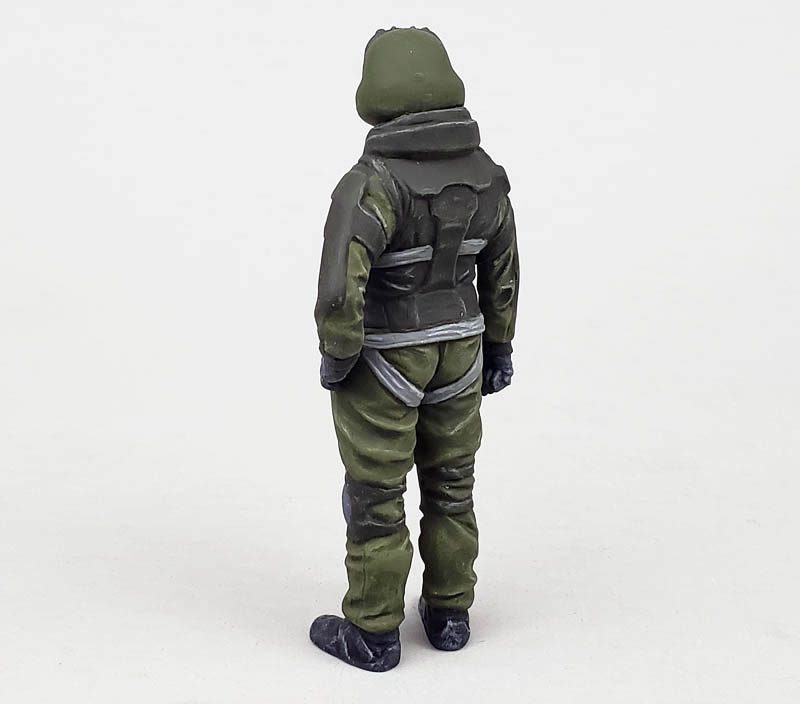
I made a few more adjustments here and there, painting straps, adding highlights and shadows, even repainting a thing or two here and there to try to improve the look.
Eventually, I realized it was not what I’d hoped for, but for the sake of moving forward, I had to declare him “finished”.
I certainly wouldn’t hold him up and say “this is how you paint a figure”. Far from it. Rather, I would say this is just further fodder for a theme I try to convey: to get better, you must tackle things you’re not good at, and be willing to not do them well – at first.
This figure is not what I wanted it to be. Yet I can look back at the faces of those Space Marines on the Landspeeder Storm, and see that I have progressed. Growth has happened. And as long as I keep working at it, growth will continue.
As a kid, it was fine and dandy to learn to shadow in the canopy to avoid drawing the faces. But to do what I do know, I must avoid that notion. The route to improvement goes through some exits of failure. Yet each time, I work through it, learn the lessons, and get back on the road.
With Jeff now painted, I can move on to the part I feel more comfortable with – weathering the fighting suit!


Leave a Reply